Far & Wide Website Development
Web design, SEO & accessibility
Here’s Why You Should Follow Our Website Development Example
This brief case study of our own website development will give you some good take-away lessons for your own website. You’ll get tips on best practices for your website, SEO enhancements like ‘long tail SEO’, and accessibility compliance methods.
Needs Assessment
When it was time for a website redesign of our own, we went through the same website development process we follow for all our clients, starting with a review of competitors’ websites and a basic needs assessment and discovery process. What are our audience expectations? How do we fulfill those? Do they want to read lots, or will they make a decision based on examples and visuals? Colour palette? Fonts? Formatting? Taxonomy? Custom build? Existing theme? The list of decisions goes on…
Theme Selection and Staging Site
We opted to start with an existing gallery-style WordPress theme. Start is the operative word here. It’s always a jumping-off point for the real build, but it did give us a head start. We selected the Kalium theme by Laborator.
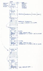
Then came the custom modifications. Taxonomy, tags, categories, sliders, relationships, groupings, sorting… Development all happened on our staging site which was blocked from search engine indexing – after all we didn’t want all of our embryonic thoughts showing up in organic search results!
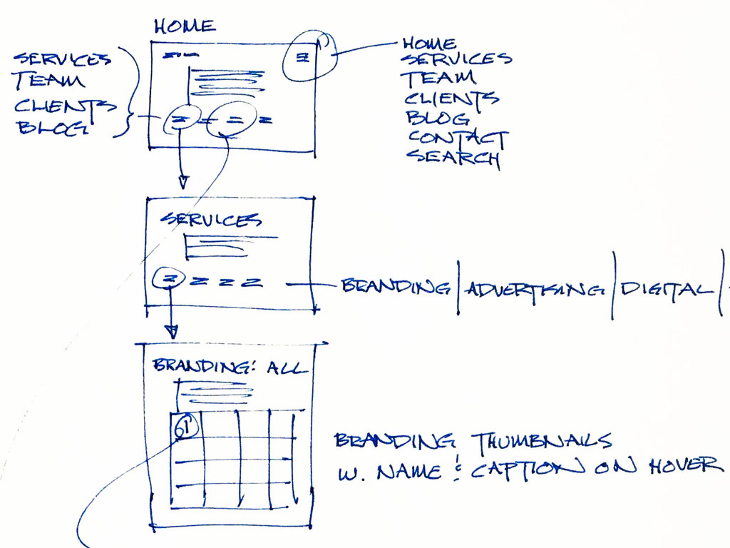
We went through many iterations with our programmers, and many internal reviews and refinements. The theme started with two basic post types – ‘blog’ and ‘portfolio’. That was a good start, but we soon realized we wanted a new post type for ‘clients‘. So we added it.
Taxonomies
Taxonomies are a scheme of classifications. The WordPress core makes use of taxonomies for your blog posts. You can add categories and tags to each post which enable all types of sorting.
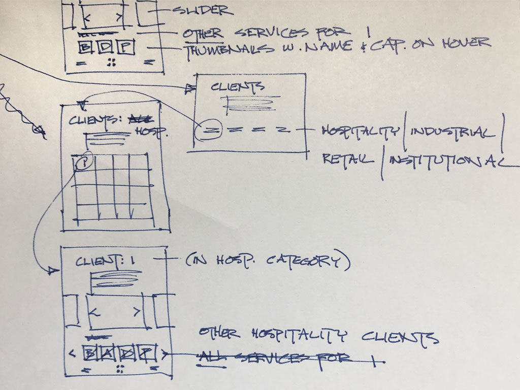
We wanted to display thumbnails on project pages for other services provided to the same client. Kind of a Netflix “Because you watched…” feature. This required adding a new function to display those thumbnails based on the client taxonomy assigned to each portfolio post.
OK, but wouldn’t it be good to show thumbnails on Client pages for other clients in the same category? Yes. So we added that taxonomy too.
The programming and reviews were happening concurrently with the new photography, writing and build out. And with the build out we kept up the SEO refinements.
SEO Best Practices
Sometimes we bent the generally accepted rules around SEO. For instance the recommended minimum copy length for a page is 300 words. But we intentionally built our site to illustrate what we do. We know that prospects visiting our site will make a snap decision to leave or look further based on the work we show. So we kept our copy brief – usually around 100 words for each portfolio post. By comparison, this page is much longer text because we’ve planned it to be ‘cornerstone’ content — which is to say we are treating it as an important, in-depth article. So rather than our typical portfolio post of 100 words this article is over 1,900 words (the recommended minimum for cornerstone content is 900).
Other than bending the recommended word count guidelines, we made sure our site complies with recommended best practices:
- No duplicate content (it’s all our copy writing)
- Avoid duplicate title tags
- No missing title tags
- All pages have h1 tags
- Use correct hreflang tag (english only)
- No broken links (we check our 404 logs)
- Optimize images for fast page loads (90% smaller file sizes)
- Ensure all images have ‘alt’ text
- Use meaningful anchor text (link descriptions)
- Use meaningful URLs (no cryptic, meaningless URLs)
We recommend these best practices for all the websites we launch for clients and we can provide training to get you familiar with how to manage these details and why they matter.
Importance of Alt Text
Let’s look at ‘alt’ text for instance. Alt text or alternative text is a plain english description of what the image shows. We avoid using images in place of text elements such as a big bold phone number, but if you were to ever do that your alt text would simply be the phone number shown in the image. If you upload an image of an event poster with important dates and location details on it, your alt text for that image should contain all of those details. Essentially you want a search engine to be able to index the content of the image, just as it would index the text of a web page. By providing indexable descriptions of images on your website, you stand a much better chance of those images showing up in organic search results for the topic the alt text describes.
Here’s an example. Our client SRK Consulting competes in a fairly narrow service sector. They provide engineering consulting services to clients in the earth resource industries. Some may describe that simply as ‘mining’, but it includes a broader range of services such as environmental assessments, site remediation, municipal water supplies, transportation tunnel design and more.
 When they add alt text for this image it’s important that the description is very granular – in other words it should be as specific as possible. Rather than the alt text saying “mine site” which is far too general, it would be better to say “Underground Mining at Ekati and Diavik Diamond Mines in the Canadian arctic”. This very specific description gives much more for search engines to index.
The result is a far greater likelihood that your image will rank very well in organic search results (everything other than paid ad results) – often better than the page content itself. This is especially true if you are competing for a good ranking in a crowded web space.
Keyword Research
When we started our SEO optimizing of pages our first step was keyword research. No point perfectly optimizing a page for a keyword or phrase that you and only you would be searching for. So we started with something related to the page content and checked it using trends.google.com Here you can enter the parameters such as the country you expect to get most traffic from. Enter a keyword and see the results. Now try a close variation and you’ll see how it stacks up to your first attempt. You’ll see where the most sub-region interest is and related topics that may help guide your keyword refinement.
Once we decided on the best option we entered that in our page and started the page optimization. The word or phrase should appear in the page title, slug (URL string), SEO title, SEO snippet (custom edited page description that appears in search results), and first paragraph of body text. Don’t overdo it or you’ll be docked points for keyword stuffing. If it makes sense, add it to the alt text for your page images. Add some internal and external links to related content and you’ll start to see improvements in your search engine results.
Long Tail SEO
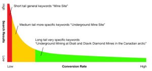
Another method we use and urge clients to utilize in their website development is long tail SEO. This image illustrates the origin of the term “long tail”. That long green “tail” shows relatively low numbers of search results for very specific search terms. However the low number of results are are like swimming in a small pond – you have a much better chance of being noticed. It can be a wasted effort to try and achieve first page ranking when you’re swimming in a sea of 10 billion results.
It’s far better to think of exactly how you behave when you do a web search. You try to narrow your results by being more and more specific. Let’s say you’re looking for window replacements. You change your search from “window replacement” to “window replacement low-e sealed units”. If that’s still too many results to sift through you add geographic parameters and search for “window replacement low-e sealed units available in Vancouver”.
By making your website keywords as specific as the search phrase your target audience is likely to use, you’re very likely going to rank high in organic search results.
The flip side of this is getting excessively specific in your keywords. It’s easy to rank #1 in organic results by narrowing the field so much that no one else is competing for that search phrase. But what are the odds that someone’s search will also be that exclusively specific?
Accessibility
We also asked ourselves what extent of accessibility standards we wanted to comply with. Our short answer was “most”.
International accessibility standards have been developed by W3C – the World Wide Web Consortium. Their standards, known as WCAG or Web Content Accessibility Guidelines outline a range of techniques that will help your site content be accessible to people with visual, hearing, or cognitive impairments.
Some website development accessibility standards overlap with SEO best practices. For instance ensuring your images all have ‘alt’ text associated with them means that visually impaired site visitors that use screen readers will know what your image is about. It will read the image description to them in the context of the adjacent narrative. Ditto for the phone number and event poster image examples described earlier. Rather than the screen reader saying “graphic” with no explanation it would read “graphic” followed by the alt text description.
What’s Covered?
Accessibility standards cover everything from legible contrast on the web page to sequential hierarchy of title tags – h2 should follow h1; h3 should follow h2; and so on.
If you include media such as video, those files should include a transcript, captions and an audio description that can be read by an accessible media player.
Improvements for people with cognitive or learning disabilities could include the use of familiar icons. “Familiar” is the operative word here. Research as shown that something as seemingly inconsequential as a new icon for an app or software update can seriously disorient someone with a cognitive or learning disability. Their daily routine works, in part, because of repeatable patterns of behavior. Something as simple as clicking on that familiar icon that they find in that same location is a repeatable behavior that helps them through their task. Change that icon’s appearance or location and you can cause serious confusion.
So if you’re complying with high accessibility standards, you may want to incorporate familiar icons to assist with comprehension or navigating site content. Remember “familiar” is the operative word. Developing your own suite of new, unfamiliar icons isn’t helpful. Better to borrow icons that are as close to universal standards as possible. The trash can for “trash”; gear icon for “configure”; open end wrench for “tools”; etc.
W3C details some of these issues and also explains how compliance can be more or less important depending on your organization. This can be a judgement call on your part, or it could be mandatory, depending on the arena you’re operating in.
Once you determine the level of compliance you are shooting for, it’s very easy to use third party websites to audit your site and provide reporting and suggestions for improvements. Some online audits are free and others are paid. These are very useful for demonstrating your level of compliance – and they are arm’s length certifications.
Services
- UX planning
- IA planning
- Theme modifications
- Custom coding
- Copy writing
- Photography

