thrive 360° branding
Christine Maassen approached us last summer with the building blocks for branding her new consulting venture. She had a clear vision for her brand promise and value proposition. She knew which individuals and organizations were the best candidates for her service offering. Her personality shone through in our first meetings. We looked at the marketing communications for others in the same space and she was very clear about what they were doing that worked and what didn’t.
These pieces were all intrinsically guiding her brand development, but what would that be? The brand promise she had already coined – “Bringing humanity to work” – was pivotal.
 Our journey began with the name. First we identified a few of the key attributes of Christine’s deliverables. Our brief discussion document let us quickly omit some and short-list the most promising. From there we narrowed our focus to a few – one of which was “Thrive” and another was “360”. It was Christine’s partner who suggested the hybrid of both and Thrive 360° was born.
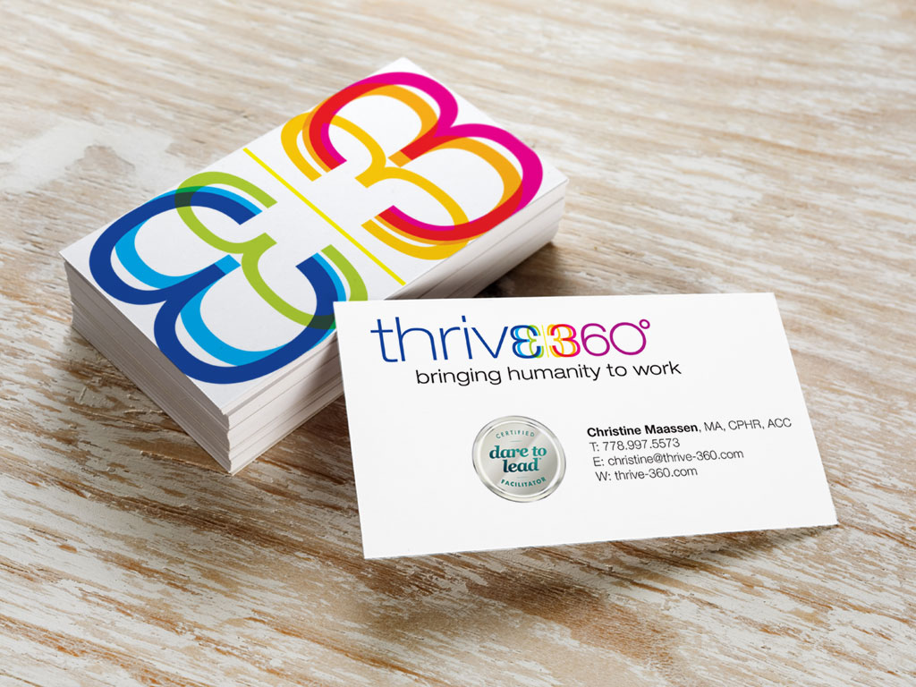
![]() So what does that look like? The concept of bringing humanity to work and fostering a vibrant, healthy environment suggested the full color spectrum be woven into the identity. But how to integrate that with the concept of 360° — the full circle? How about the modified “E” rotating through 180° to morph into the 3 of 360°? We refined font weights and cases; scaled relative sizes of elements; and adjusted color hues and contrasts. – Works for us, but, more importantly, it works for Christine.
So what does that look like? The concept of bringing humanity to work and fostering a vibrant, healthy environment suggested the full color spectrum be woven into the identity. But how to integrate that with the concept of 360° — the full circle? How about the modified “E” rotating through 180° to morph into the 3 of 360°? We refined font weights and cases; scaled relative sizes of elements; and adjusted color hues and contrasts. – Works for us, but, more importantly, it works for Christine.
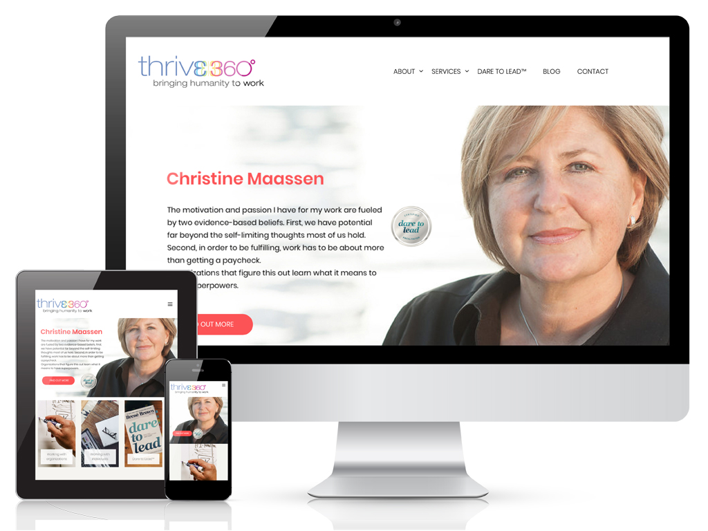
From here we went on to develop and launch the website; prepare powerpoint templates, stationery, and social media files. Then re-themed Christine’s personal blog and suggested reciprocal links and link building through her social media platforms.
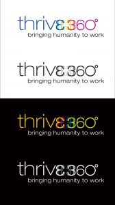 We made sure Christine and her suppliers had 24/7 access to her logo in a complete range of file formats and color palettes by creating an index page on her website that she can selectively send the URL for. And since the dark hues that provide maximum contrast on white backgrounds recede on dark backgrounds, we prepared the alternative color and greyscale versions for reverse applications.
 As a Certified Dare to Lead Facilitator™, we also prepared facilitation sheets, powerpoint templates and a vector file version of the certification seal to ensure crisp reproduction at large sizes and in print applications.
Working with Ian and Kate from Far and Wide was a great experience. In the past, I found my dealings with marketing professionals to be challenging. The enthusiasm for what is possible in that space seems to create a barrier to listening to the client’s needs and wants. Ian was the complete opposite. By the time we connected for a first call, Ian had a surprisingly deep understanding of my vision and was keen on ensuring his work supported mine, not the other way around.
The collaboration was easy. Ian and Kate had great recommendations and ideas all along. They were always reliable with deadlines for deliverables and available when needed. Ian has also been very responsive to my eagerness to develop some skills to take care of basic site updates.
I have received many compliments about the final product and people consistently comment that they can hear my voice throughout the site. I have no hesitation about recommending Far and Wide.
– Christine Maassen, founder, Thrive 360°
Services
- Name development
- Logo design
- Site design
- Copy editing
- Collateral design