Branding design challenges
See how Apple, Nokia, & Bell overcame their branding design challenges
Planes, trains, automobiles
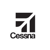
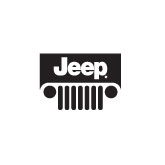
Identities for a specific service or product have the advantage of utilizing familiar icons or imagery to communicate their meaning. Cover the word ‘Cessna’ and the logo is still an aircraft. The logo for Canadian National Railway suggests the continuous, unbroken path of a transcontinental rail system as does the Amtrak symbol. Jeep capitalizes on their distinctive grill to brand their line of vehicles. These brands didn’t always have this level of instant recognition, but they did all overcome similar branding design challenges.


Classic evolution
It’s not unusual for the identities of young companies to be the same as their flagship product or service — who they are is synonymous with what they do.
Many are closely tied to a single product, service, location or founder(s). Inevitably they outgrow these specific references as they evolve and mature.
This is often the catalyst for rebranding and the lesson learned is to focus on broader corporate attributes. These qualities are often less tangible than their goods or services and more abstract in nature. Visually communicating abstract concepts can be challenging. Here’s how Nokia, Apple and Bell have addressed that challenge.
Nokia
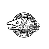
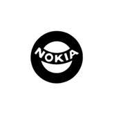
When Nokia started as a pulp mill on the banks of the Nokianvirta River in Nokia, Finland, their original logo depicted a fish — tying them to their geographic location. In over a century of operations, their manufacturing has included wood and paper products, rubber tires, rubber bands, consumer and industrial electronics and more. The Nokia we know today is focused on telecommunications services and products. Along the way, they have dropped any suggestions of specific location or product niches and settled on a simple, clean type face underscored with the slogan ‘Connecting People’.
Apple
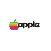
The overly complex original Apple logo illustrated Isaac Newton sitting under an apple tree and was inscribed: “Newton… A Mind Forever Voyaging Through Strange Seas of Thought… Alone.” Its creator, Ronald Wayne, one of Apple’s founders, sold his 10% share of the company for a one-time payment of $800 (apparently his business skills matched his design skills).
Steve Jobs, whose mantra was always simplicity, had Rob Janoff of Regis McKenna Agency design the iconic striped apple. The more modern ITC Garamond Condensed typeface appeared in 1984 when Apple introduced the Macintosh. From 1984 to 2002 that typeface branded everything from the company to hardware and software developments such as QuickTime and FireWire. During that period, the rainbow striped apple gave way to several simpler, monochromatic versions.
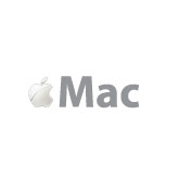
Since 2002, Apple has consistently used the sans serif font Myriad Bold in all their communications. That font now brands the company, their iPhones, iPods and other hardware and software.

Bell
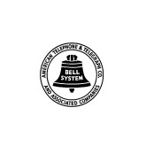
Bell Telephone Company’s roots stretch back to 1875 with founder, Alexander Graham Bell’s invention of the telephone. Purchased in 1899 by the one time subsidiary, American Telephone and Telegraph (AT&T), the Bell System was later divested as a result of an antitrust suit separating AT&T from 7 regional Bell operating companies. The circled Bell symbol was designed in 1969 and achieved a remarkable 93% recognition rate in the USA.
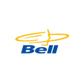
The italicized Bell logo with the gold profile and open swooshes was introduced in 1994 with a complicated rationale “At the centre is the human profile, representing Bell employees and the focus of all their efforts, the customer. The profile is set within two open rings, symbolizing the dynamic future of telecommunications — the ability to transmit sound, image and data instantly, wirelessly across all frontiers. The Bell name appears directly beneath the profile, a graphic representation of how the company supports customers in all their communications needs.”
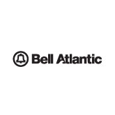
The simple sans serif, blue logotype — an update of corporate design manager, Don Black’s 1977 wordmark — was introduced in 2008 with this equally simple rationale, “The new Bell logo is a strong and clear representation of the company that proudly wears the traditional Blue.”


Simplicity
The logic of a company’s brand evolution from specific, and often complex, designs to simple, clean statements is easy to understand. The simpler the identity, the broader its possible applications. Simplicity also improves its longevity — specifically through the use of timeless, classic fonts and colours — rather than trendy alternatives.
Without exception, successful corporate identities use an economy of means and strip away any unnecessary frills.
The qualities we associate with the graphic elements should reinforce the qualities we want to associate with the company. Upper and lower case is more casual and approachable than all caps. Serif fonts tend to evoke traditional values and nostalgia. We associate sans serif fonts with clean, modern efficiency. Roman fonts appear grounded and more stable than italics. Heavier weights seems more masculine — and so on.
sources:
Nokia:
https://www.nokia.com/en_int/about-us/who-we-are/our-history
Apple:
http://en.wikipedia.org/wiki/Typography_of_Apple_Inc.
http://en.wikipedia.org/wiki/Apple_Computer
Apple Confidential — The Real Story of Apple Computer, Inc. By Owen W. Linzmayer