Exchange Energy Branding
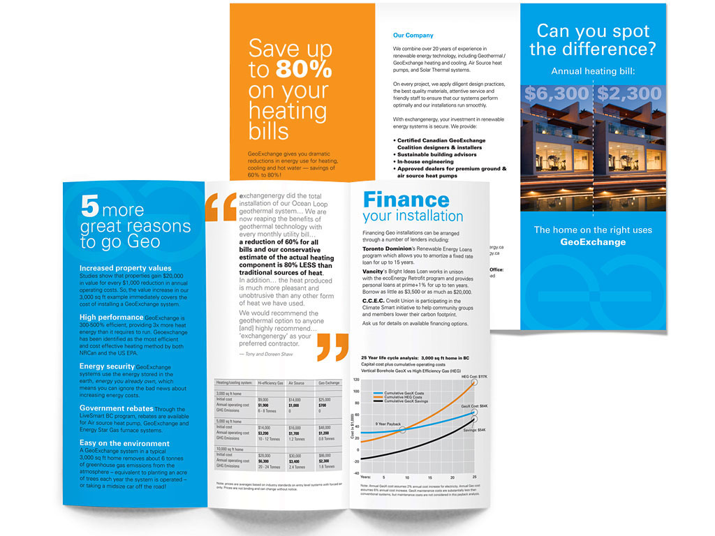
The US EPA says geo-exchange is the most energy efficient technology to heat or cool buildings.
It’s so damn efficient that’s what we installed in the house we’re building on Galiano Island. It’s a bigger nut to cover right now, but going forward, we’ll have no fuel costs and 17% of the energy requirements of a high-efficiency heating system (assuming energy is the same price then as it is now, which I’m betting is pretty unlikely).
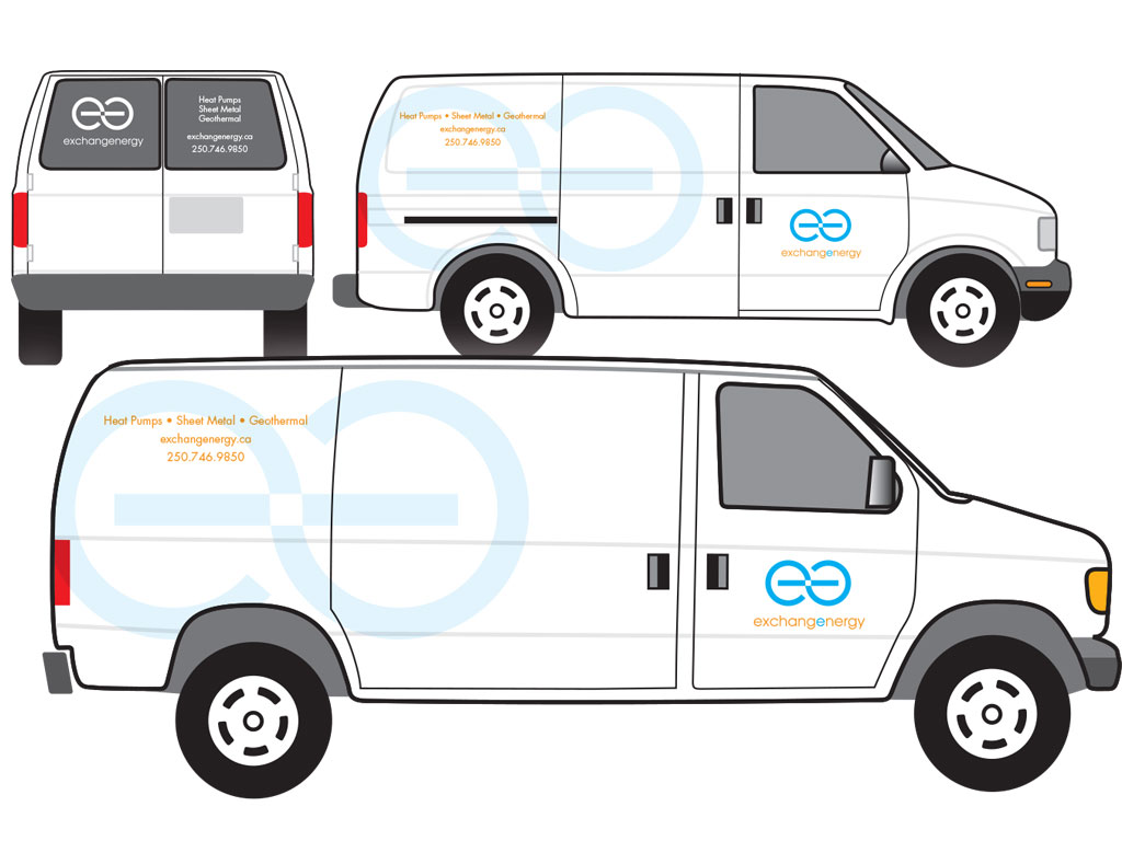
Green as the technology is, we chose a hot/cool color palette for Exchange Energy’s identity and brand development. It was the obvious choice to communicate this key benefit to prospects that may not fully understand geoexchange technology.
The client was struggling with some way to incorporate the infinite loop. Rotate one of the double ‘e’s; make a few tweaks and we’ve got it! A logo that communicates the infinite energy supply that is tapped by geoexchange systems.
Apparently it all paid off. Within a year Exchange Energy was in the cross-hairs of Geotility, who soon-after acquired them. Geotility is the company we contracted for our installation.
Thank you Ian! It works perfectly. … I always had in the back of my mind that it needed to suggest a loop or a continuous movement… You succeeded with style!
— Andrea Dobbs, Communications Director
Services
- Creative direction
- Logo design
- Print design
- Copy writing
- Fleet graphics